
Change is an inevitable phase for brands like other formations. They need to stay fresh and shout out their uniqueness to survive in a fiercely competitive business world. Once implemented at the right time, rebranding adds value to the brand image and highlights the organization’s innovative reflex to be on the frontline of progress.
One of the major milestones of 2018 for us was the rebranding project of our beloved brand SmartMessage. Today we are thrilled to share you the output of our hard work in the last months hoping you will enjoy the new look and feel of our brand.
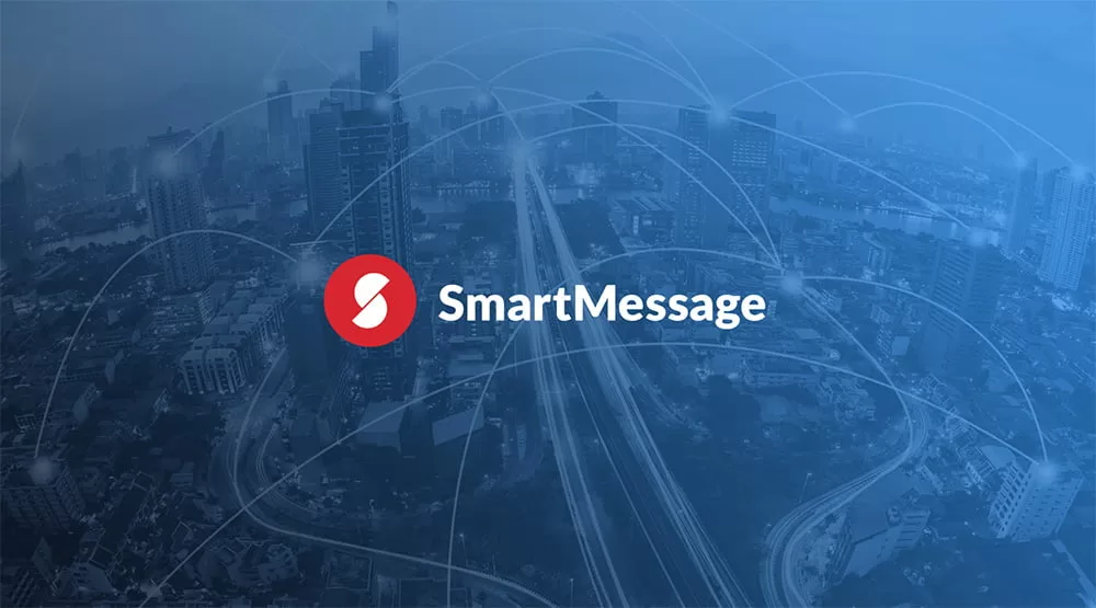
Everything Starts with It: The Logo
 As we went through the rebranding phase, we had to chance to analyze our long lasting relationship with our clients in details as well. In light of our analysis, we planned to come up with a new image that will reflect our reliable, innovative and energetic image and our harmony with the corporate world.
When recreating the most important visual element of a brand, we kept on track with new design trends and aimed to highlight our name in the logo as well. To preserve brand continuity, we maintained our colors a new modern look. We also added the icon part to our logo so that users could easily relate to us in mediums like social media. We believe the result is more recognizable and bold. Logo variations with different backgrounds also reflect our character.

The color red in our logo symbolizes the passion for what we do. The black, on the other hand, underlines the reliability and determination we provide. We combined colors with modern a font face to visualize our attitude in delivering our promise. We use the icon for different patterns and visual elements to enrich our brand image.
 When it Comes Down to the Typography
 When it Comes Down to the Typography
Fonts are also essential parts of the corporate identity. Maybe some of you already realized the change in fonts on our website. We continue our journey with Lato font family. The reason Lato won our hearts was the modern look and readability factor. Lato also reflected a corporate image that we aimed to find. We believe it is one of the best fonts to express the characteristics of SmartMessage.

Colors and Other Visual Elements
Main colors reflect our determination and reliability. We also use red to highlight our passion and energy.
 For secondary colors, we preferred vivid colors to stay close to modern design trends.
 For photos and similar images, we wanted to express positive moods with a sleek corporate style. Putting “the human being” at the center of our design works, we aimed to express the “engagement” (The leading keyword that defines our efforts) with attractive visual elements.
 Through the rebranding period, we worked with great pleasure to come up with a new look that you will like and engage with easily. We hope you liked the new look and feel of SmartMessage.
Hope to create new success stories with you soon 🙂

